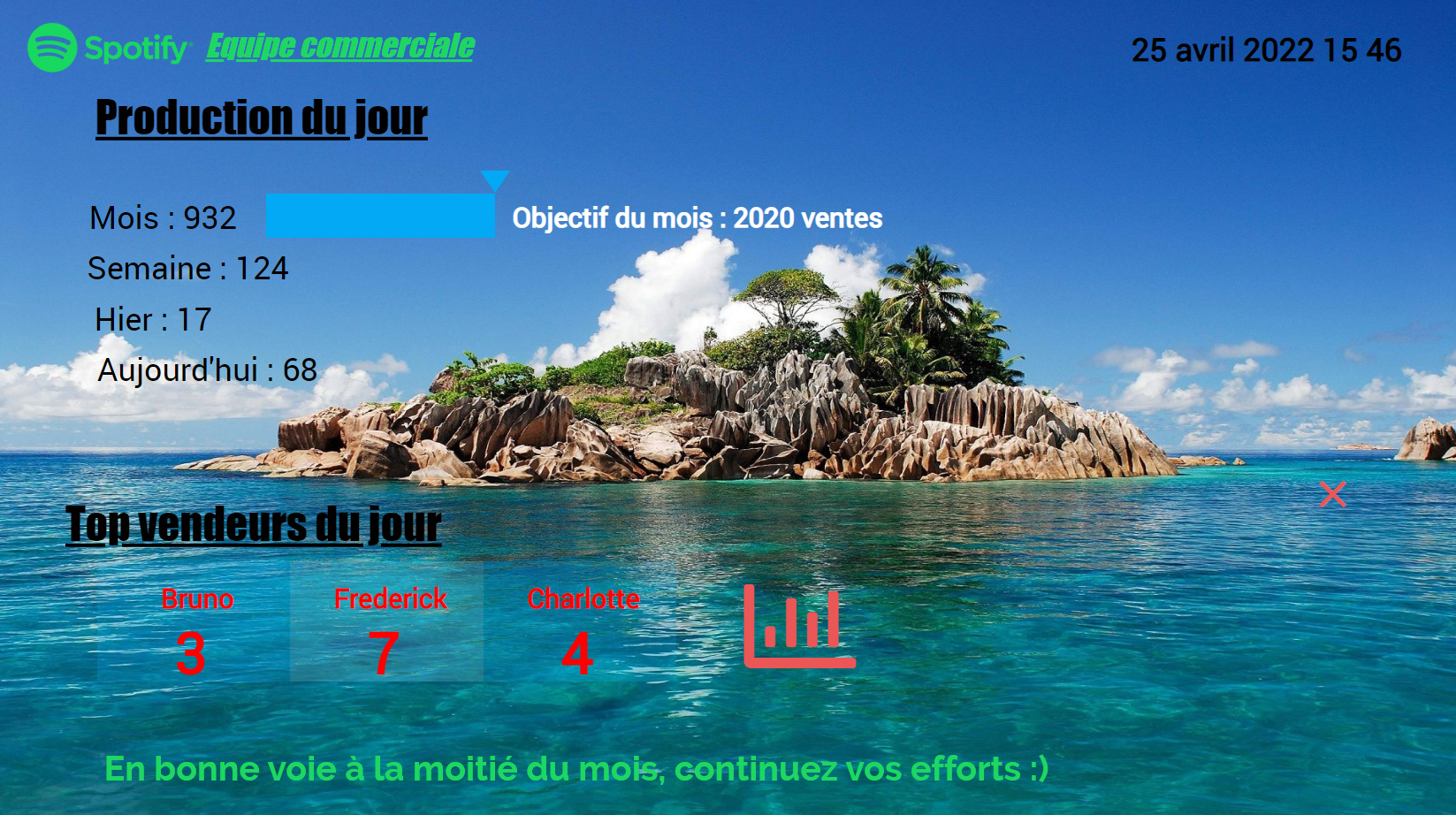
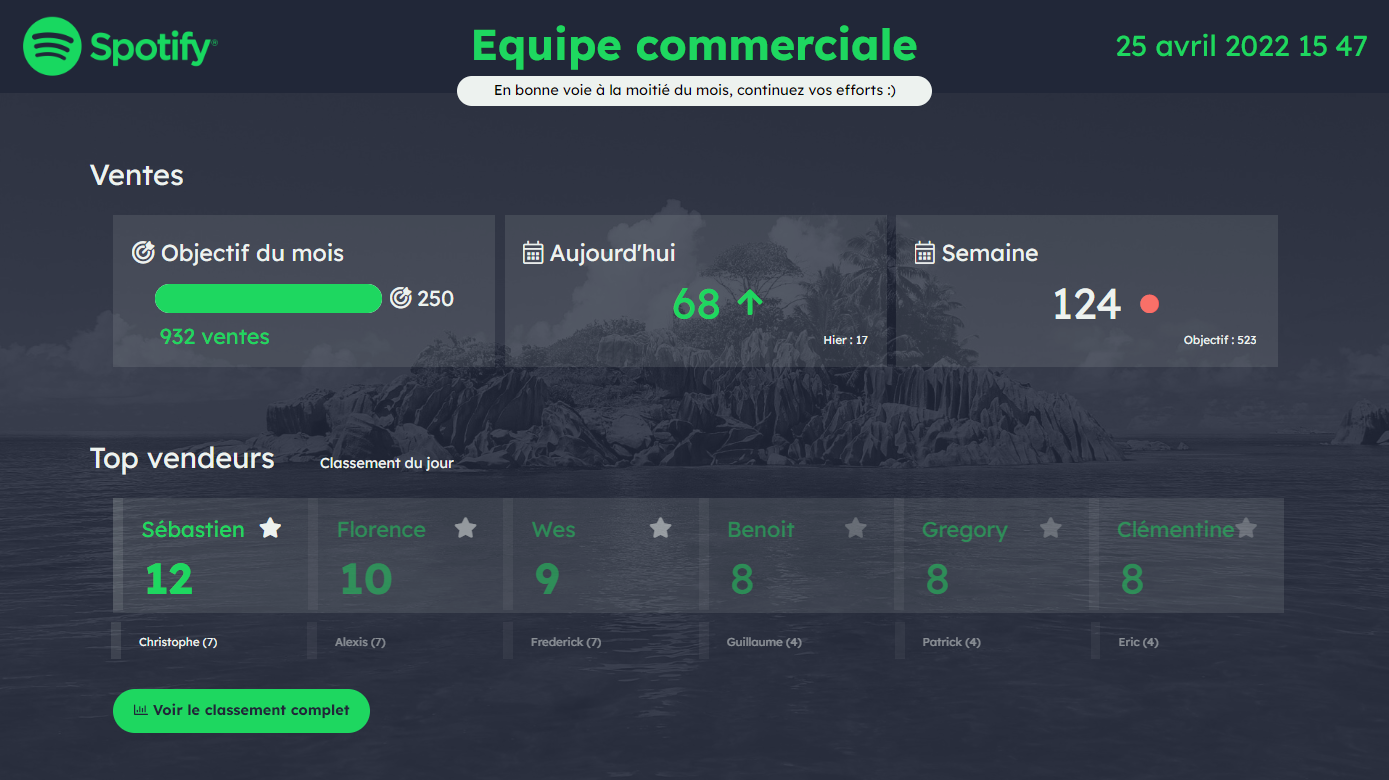
What is the goal to achieve with the wallboard ? Less is more. Achieve the most synthetic and efficient presentation possible of the desired information. It is interesting to familiarize yourself with the main principles of UX/UI design, which are often summarized in 5 main “laws”:
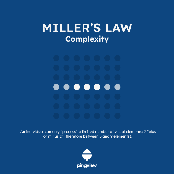
1. Complexity : Miller’s Law
The law : an individual can only “process” a limited number of visual elements: 7 “plus or minus 2” (therefore between 5 and 9 elements).
The application: Less is more, limit the amount of information on your screen
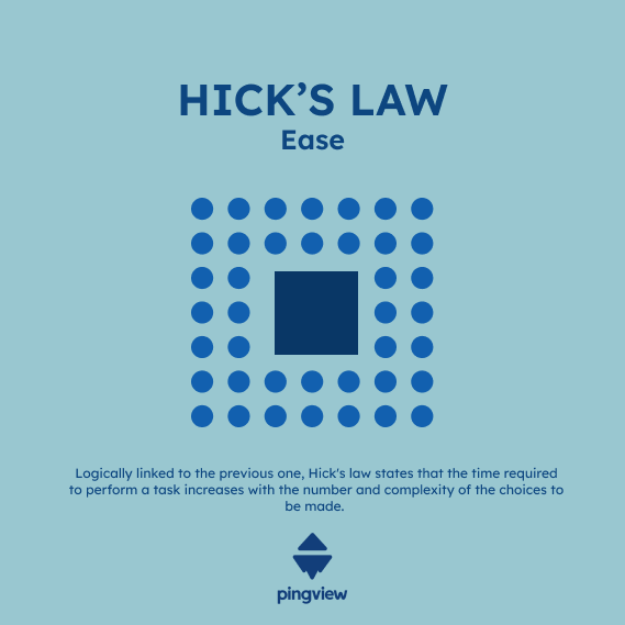
2. Ease: Hick’s Law
The law : Logically linked to the previous one, Hick’s law states that the time required to perform a task increases with the number and complexity of the choices to be made.
The application: frame the information reading grid as much as possible, and always choose the formatting that is most immediately understandable
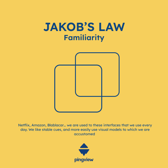
3. Familiarity: Jakob’s Law
The law :Netflix, Amazon, Blablacar… we homo numeréricus are used to these interfaces that we use every day. We like stable cues, and more easily use visual models to which we are accustomed
The application: don’t reinvent the wheel! Base your mockup on proven designs
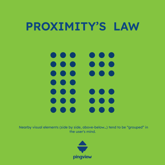
4. Position: Proximity’s law
The law : nearby visual elements (side by side, above-below…) tend to be “grouped” in the user’s mind.
The application: use zoning to group together indicators that “work” together in the same are of your screen
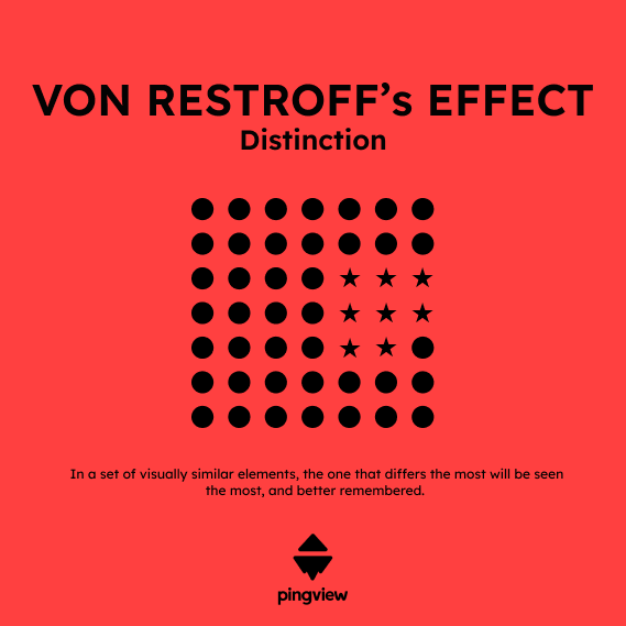
5. Distinction : Von Restroff’s Law
The law : in a set of visually similar elements, the one that differs the most will be seen the most, and better remembered.
The application:is there a more important KPI or OKR than everything else? Treat it differently from others (color, size, animation …)
Here is a wallboard that does not respect the laws of UX/UI (left) and a wallboard applying the laws of UX/UI (right):
